
Web.com Group Inc: Corporate Rebrand initiative
One company, one focus, one Web.
After the acquisition of Web.com Group Inc. by private equity group Siris Capital, there was a need to relook at the brand strategy moving forward. This meant moving from a branded house to a house of brands to better leverage the individual brand’s equity. What this further meant was there now needed to be an umbrella corporate brand developed that separated itself from its go-to-market brands and become an inflection point for future potential buyers.
Role: Creative Direction & Designer

Simplified Logo & Naming Convention
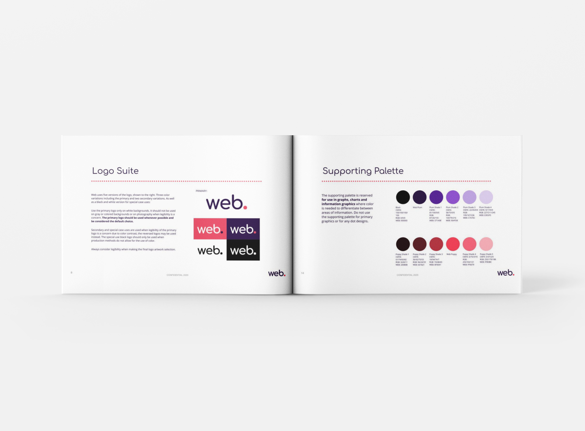
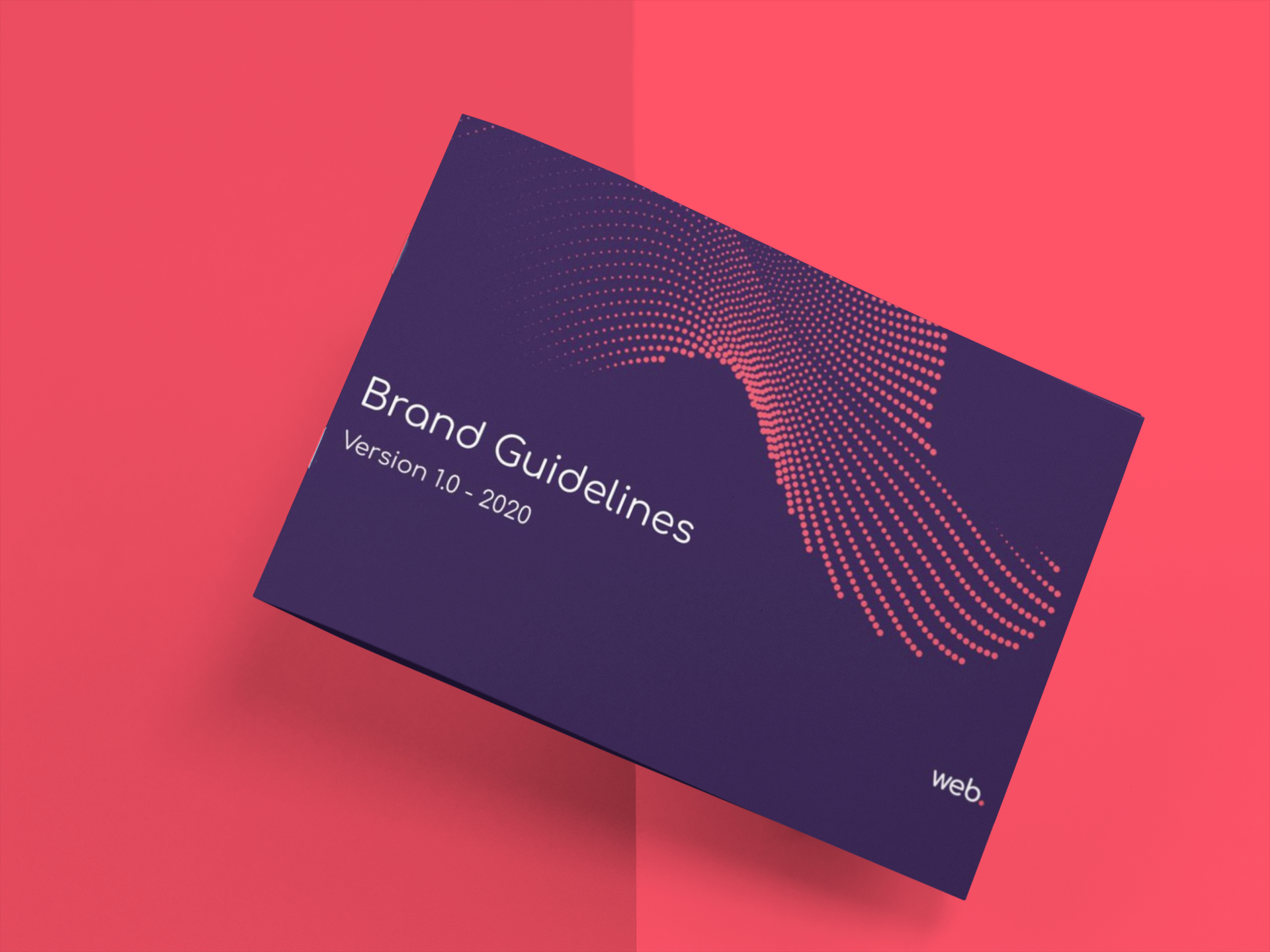
Full Brand Guidelines Developed

United, We Are One Web
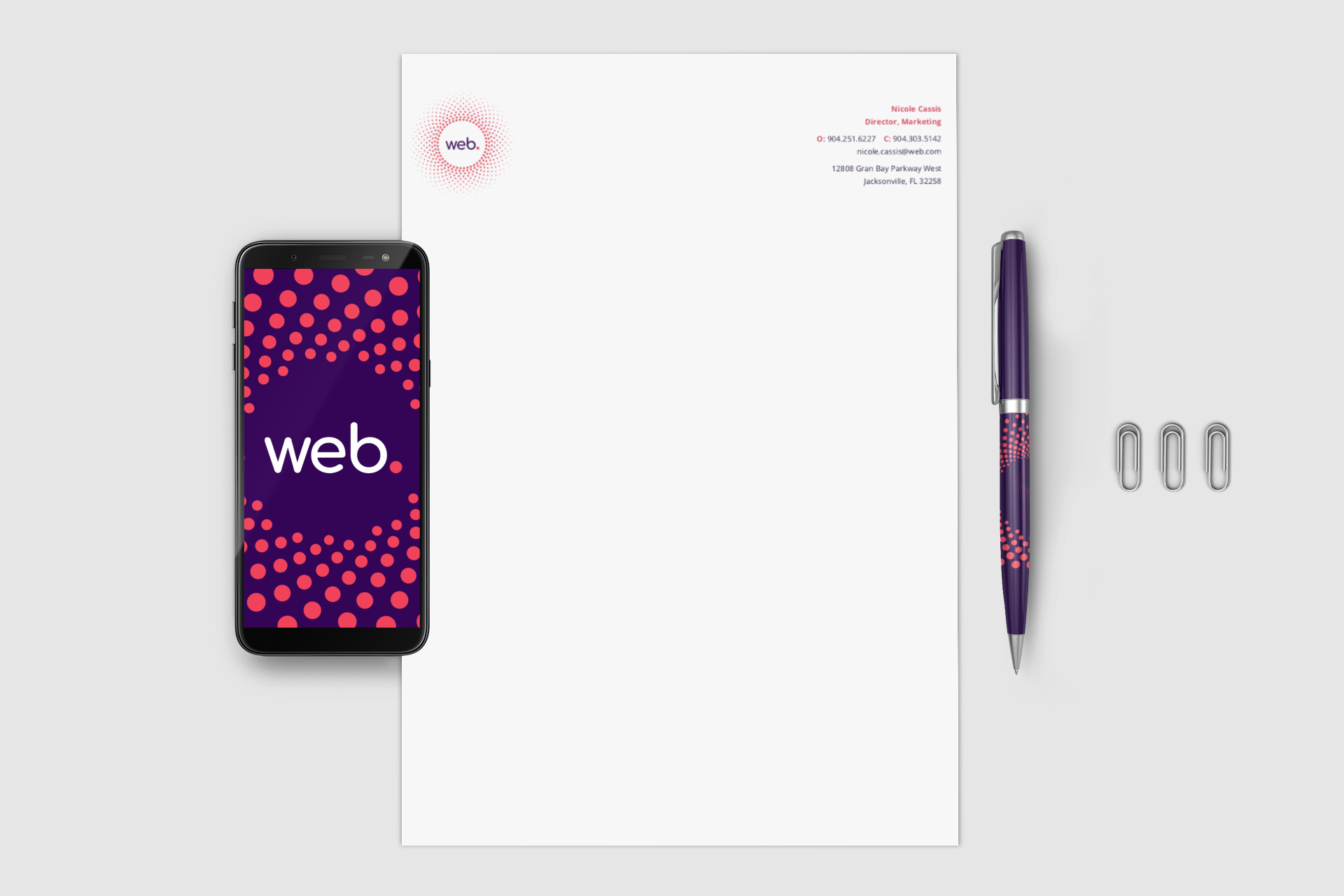
The dot is the cornerstone of the new visual identity. It represents both the historical context of the company as a domain provider, a .com, as well as the future vision of being a modern digital company with best-in-world products.
In execution, dot patterns are used abstractly to convey the message or purpose of the artifact.
For example, the dots could represent each and every employee, moving towards the same purpose. Another example, a business card with a dot pattern expanding out, much the same as one expands their network with business cards.
Collateral Pieces


Environmental Graphics


Digital Experiences


Company Schwag


RESULTS
Delivered all assets and guidelines within an aggressive 4 month timeline.
Positive feedback from employees, board members and executive leadership.